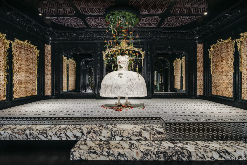
There’s nothing ordinary, nothing expected about a windowless ballroom on the lower level of an 18,000-square-foot 1904 Presidio Heights home that’s modeled after Le Petit Trianon at Versailles.

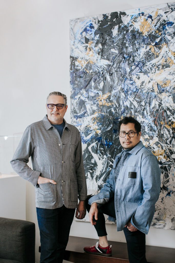
Vernon and Gioi at home (photo: Jasmine Van T Photography)
But Gioi Tran and Vernon Applegate of Applegate Tran Interiors know how to accept a challenge. Add enough massive mirrors to make Marie Antoinette smile, plus a fabulous bar, a curated collection of customized whimsical art, et voilà… In the designers’ words, “Eighteenth century Europe meets the 21st century world in a contemporary ballroom layered through time, connecting generations with art, light, and music.”
Where are such visions born? How do they take form and flight? What about the practicalities of interior design at home?
We talked to Gioi Tran, Founder and Principal Designer to get a peek inside his world of the creative imagination, inspired by a love of art, cooking, flower arranging and entertaining.
HL: As a designer, can you describe what happens when you walk into a space for the first time?
GT: It’s always an exciting moment as I envision countless possibilities to transform it into something magical. I say “magical” because once a vision has been implemented it generally stirs our clients’ emotions, taking them to a place they couldn’t have reached on their own. During those first moments I dream of how to pay tribute to the architecture, how to elevate and improve the space. I contemplate a client’s personality to form ideas. The creativity found in that initial moment produces first instincts that often prove to be the foundation for the design. Of course, trusting those instincts comes with time and experience.
HL: And as a multi-faceted artist and designer, do several options speak to you?
GT: As both an artist and designer I have a very clear point of view. So does my husband, Vernon—amongst his many talents are his incredible sense of color and a knack for mixing patterns and textures. We often come to a design from slightly different viewpoints, but we completely trust one other’s creativity and judgment. By evaluating all ideas we create and present a clear vision that then drives the process. Our clients will provide input on the final choices.
HL: Do your senses kick in to play off one another, even beyond the visual?
GT: Great interior designers must use all five senses to create a beautiful, comfortable and functional environment. The sixth sense? Understanding what clients want as we consider lifestyle, entertaining, relaxing at home and how each person is unique. We consider how materials feel to the touch and how sound is distributed through the home. Practical aspects like ventilation must be considered.
I am a passionate chef, so when designing a kitchen and a dining room, smell and taste come into play as I think about the ways presentation has an effect on how food tastes. We apply this approach in choosing the appropriate finishes, also in assisting clients with their selection of cookware, tabletop and linens. The right pot can do a lot for the flavor of a dish, the choice of a plate makes a difference on how the food is presented, and different glasses can change the experience of a particular wine.
“There has to be a flow, sprinkled with surprises as we consider both aesthetic and practical aspects using art and accessories to express personality.”
HL: Do you envision who will step in and what will occur in the space?
GT: For sure! We imagine ourselves in our clients’ shoes—as well as their guests’—as they travel through the home, paying special attention to the entry as a first impression. Aesthetically, the interiors should represent who the owners are. There has to be a flow, sprinkled with surprises as we consider both aesthetic and practical aspects using art and accessories to express personality. From a practical perspective, interiors require both form and function, two driving forces of good design for both everyday purposes and for entertaining. We entertain a good deal, so our own home becomes a testing laboratory. As a result, we know how to accommodate a small dinner party or a large group. In large spaces we create areas for a more intimate feel, and in smaller homes we thoroughly plan for flexibility and storage to accommodate bigger events as well.

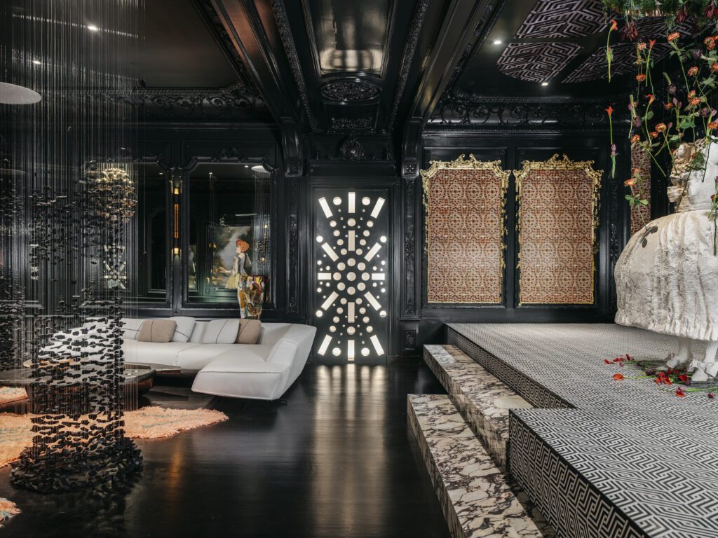
HL: Case in point: Tell us more about this stunning mirrored ballroom you created for the San Francisco Decorator Showcase last year.
GT: We spent a lot of time in the ballroom to physically and mentally study all the components, scale and proportions, as well as the original design details of the room. We thought about its original use and how it could be best utilized today, leading us to design a 21st century private nightclub. We designed around multiple seating groups, and of course, an all-important bar area. A handful of people could feel comfortable having drinks or playing a board game in one area, or 100 people might be entertained by performers on the stage. It is a flexible, fluid space, so we chose organic and curved shapes for that reason.
“Aesthetically, the interiors should represent who the owners are.“
HL: Can you take us on the journey in your imagination that allows a dull windowless room to become a captivating sleek and sexy mix of Berlin nightclub meets the Court of Versailles?
GT: A windowless room has its challenges but it also allowed us to control the environment to create an emotional vibe. We decided to emphasize details inspired by Le Trianon at Versailles, envisioning a contemporary space that, while paying tribute to the original 18th century inspiration, also has today’s Zeitgeist. By painting the boiserie extremely dark we contrasted the mirrors’ reflective surfaces to create a sexy backdrop for the contemporary furnishings and art, honoring the Rococo while adding drama and whimsy.
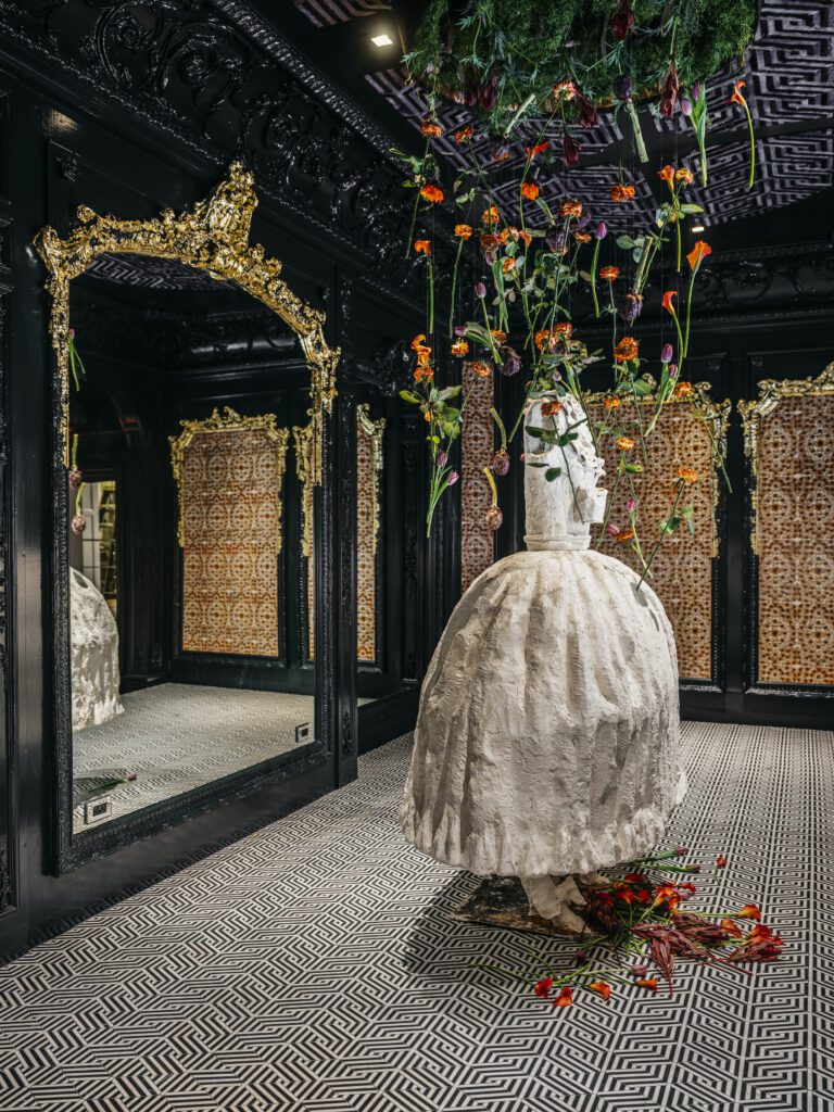
Kyle Bunting made a cowhide panel suspended from the ceiling based on the layout of the gardens of Versailles. Linda Horning painted male and female 18th century style portraits on multiple clear acrylic panels to create three-dimensional viewpoints. She also fashioned an over-scaled sculpture of a Rococo period gown from plaster that became the centerpiece of the stage. Floating charcoal columns by Korean artist Seon Ghi Bahk were a nod to historic architecture while also feeling ephemeral and organic in a space that is dramatic and void of nature. We played on the contrast of 18th and 21st centuries, emphasizing commonalities in the desire to entertain contrasted with the distinctions of how.
HL: At Applegate Tran, what are the overarching stylistic changes you’ve seen in interiors over the past two decades?
GT: People live and entertain differently today than they did even 20 years ago. There is less separation between rooms and more open spaces, therefore more continuity is needed throughout. Styles are an ever-changing process, yet excellent design endures the test of time, as proven by some of the greats that have come before us. We always aim to design interiors that last. While we may revisit a home a decade later and may refresh some areas, we also realize that when clients invest in quality design it pays off in the long run.
“Just like fashion stylists help bring out someone’s best features and personality, we do the same in a home.”
HL: Are there any preferences or trends that are signature Bay Area?
GT: Aesthetic preferences in the Bay Area tend to be more conservative than in New York or Los Angeles and many areas in Europe. Clients here are somewhat more practical and often more cautious about fully expressing themselves. Many may select interior designers with a signature style that appeals to them, rather than collaborating with a firm that offers more variety in styles and will create a vision that is particular to their tastes. Occasionally, prospective clients question whether our portfolio reflects their style, not realizing that together we create their style.
Just like fashion stylists help bring out someone’s best features and personality, we do the same in a home. Personally, I would like to see more homeowners in the Bay Area trust interior designers to come up with a bespoke vision truly created for them.
HL: Your portfolio showcases such a broad range of styles, from woodsy Tahoe retreat to an edgy urban penthouse. It may be unfair to ask your personal favorite style, so do tell us about your own interior at home.
GT: Indeed, which emphasizes my previous point. We really don’t have a favorite style. While Vernon generally leans more to contemporary, I also absolutely love traditional interiors. These two perspectives help us understand clients with all sorts of preferences. We believe that good design is not necessarily related to a particular style, and definitely not based on trends. Again, each home requires attention to the architecture, and we have been lucky to work with some great architects. Once you add the clients’ tastes the design direction becomes clear. Who wants their place to look like the Jones?
Our previous home in the East Bay was a beautiful Tudor, which influenced the interior to be more transitional. Our current home in San Francisco is an old warehouse that was extremely raw when we first purchased it. We celebrated its industrial bones and informality by not covering rough edges and flaws, which contrasts beautifully with the elegance and sophistication we added. The contemporary Poliform kitchen perfectly nestles into a corner, and additional cabinetry in the same finish with glass doors creates a hallway to separate the TV lounge area from the powder room and main living area. Sleek finishes complement the rough concrete floor and walls.
We layered the spaces with contemporary furniture, vintage pieces, bold lighting, our personal collection of objects from our travels and lots of art. It is currently mostly my own art, as our home has become a testing ground and gallery for my work. The pièce de résistance many may feel is our 14-foot steel dining table. We have several dinner parties every week and I love setting the table in a different way each time and creating bold floral arrangements. I find the latter very meditative and flowers bring life and nature into our very urban and industrial home. I express much of my love and passion through cooking, finding pleasure in spending time at this table with my friends. So the dining table may be the hearth of our home, so to speak.
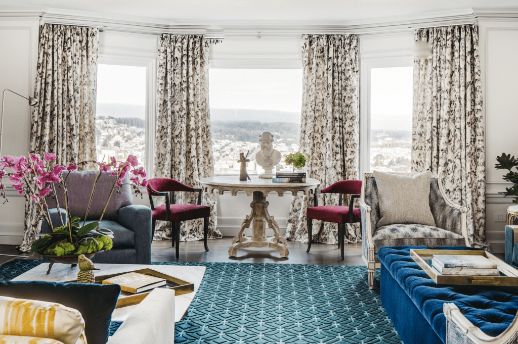
HL: We just love the look of the Russian Hill project that pairs classical and contemporary in colorful harmony. Tell us more?
GT: Exactly the goal. We paired traditional with contemporary furniture and fabrics which we layered with bold color and mixtures of patterns and textures. We did not adhere to a color scheme throughout, but simply addressed each room as if it were its own painting, adding neutral areas like the kitchen and bathroom as respites from the intensity of some of the shades. While the dining room walls are an enveloping dark blue, the living room’s light walls emphasize the color accents of the furniture and art. In contrast, the bedroom has a softer, more restful palette. Each room offers its own surprises and balance of color and texture.

